How to…Paint the Queen – Initial sketch

How to paint the Queen?! I don’t even know how it happened, but as I just stumbled across a series of progress photos…..

Well, we had just spent a wet weekend in June, waving wet Union Jacks from a wet bridge at lots of wet people as they passed by in, on and around boats of varying degrees of wetness. Then, one minute I’m drawing David Beckham (just for fun, you understand, not personal pleasure) the next I’ve been talked into painting a portrait of HRH Queen Elizabeth II. Caught up in the sentiment of the whole Diamond Jubilee thing I was challenged by my niece to enter (with her) the Daily Mail’s portrait competition. The rest, as they say, was history…though I don’t think my niece quite got round to paint the queen – I guess her portrait is still history in the making!

Queen or just plain commoner (it’s all the same in the end), painting a portrait is quite a difficult thing in my opinion. Whether it’s of a person or an animal, in the end it has to look “right”, especially if someone has commissioned the piece. That’s not to say it has to look exactly like a person or animal in all respects, like a photo would, but this is one area in painting where the end result has to capture the essence of the subject. OK, so it is only my opinion, but if you set out to paint a well known figure like the Queen, most people will know if you’ve got it drastically wrong – I guess Picasso might disagree, or perhaps he just knew some really weird looking people.

So I have already assumed it’s unlikely she will sit for me and picked a favourite from the endless stream of pictures from recent events – it has to be one where she’s smiling for me! I have both a colour and a black and white copy (B&W makes it easier to understand the tonal values of the picture i.e. lights and darks, without letting colour confuse my eyes).

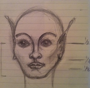
I’m also armed with my mental picture of the general anatomy of the human face and head. You might notice this is my slightly stylised version (I’m not suggesting HRH is a fairy or from the planet Vulcan – I just can’t help but doodle). This age old proportional information is what I was taught at school and I’ve applied it many times since:

image showing the proportions of the human face

1. Head = upside down egg

2. 1/2 way down = eye line

3. 1/2 way again = nose line

4. 1/2 way again = mouth

5. Eyes = 1/5 of width of face & 1 eye width apart

6. Nose = 1 eye width wide


It’s important to bear in mind that this “rule of thumb” information can only provide a starting point for any portrait helping to get things in roughly the right place. After that our observational skills have to pick up the characteristics that reflect the unique differences that make a particular individual i.e.gender, race, age etc.

So, back to my challenge to paint the Queen…..

Step 1 – Outline measurements

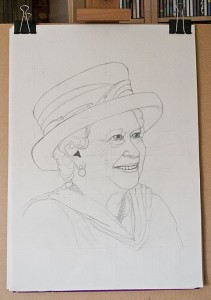
Outline pencil sketch of the Queen

I’m normally quite loose in the way I work, but for this exercise I meticulously measure and plot out the various angles in the image (you can make these out in the preliminary sketch) and the comparative dimensions of the face e.g. how many eyes wide is the face, lips etc.

I plot these out on a sheet of cartridge paper, along with an outline of the key features I want to incorporate in the finished picture. I also multiply measurements to increase the scale of the picture to something just about life size on the canvas. In no time at all I have my outline sketch.

Step 2 – Transfer to Canvas

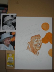
I prefer to make any significant changes to the composition at this stage rather than after I’ve transferred the image to canvas, mainly because it’s much easier to adjust minor errors on paper! The hard work already done to adjust the image and increase the scale I can now simply trace the key elements of my sketch to and transfer the important reference points to my canvas. After marking the key elements I work to join the dots, just like in the puzzles I did as a kid – the key to success is identifying the right points and transferring them across. This time I used       a fine pencil to mark out my subject, ready to accept the first layer of under-painting:

Outline sketch of the Queen on canvas

3. Ready to paint the Queen…..

Next time I’ll outline my approach to under painting, the techniques and colours used to provide the foundation layers for the painting. In the meantime you could have a go at creating your own outline portrait. Any photograph would do for practice or you could try using a mirror and make it a self portrait!

HELP! Take me to Part 2 | Part 3

What is Art – Ashley Jackson?

The Big Draw – Ashley Jackson and Graham Ibbeson that sounds like fun!

On a cold but sunny Sunday morning we’re up much earlier than usual on our traditional “lie in” day. Warm coats, waterproofs and camping seats loaded we gather up a couple of grandchildren (not mine, but they are known to me, so I haven’t turned into some strange Chitty Chitty Bang Bang Child Catcher) and head for Cusworth Hall, Doncaster. It’s a beautiful day and we’re all set to receive our instructions from Ashley with art pads and pencils at the ready. Whoops! We’re 2 hours early, but never mind!

When we get started some time later we’re greeted by Ashley (wearing his trademark long waxed coat over his artist’s smock) and Graham who offer an insight into each others work to get us started. It’s already interesting to pick up their enthusiasm for what they do, their respect for each other and their typically no nonsense “Yorkshireness” (yes, I think I’ve made that word up) – I mean that down to earth bit about them that throws doubt on some of the more modern approaches to “Art”.

We’re off…we’re going to learn how to draw, nay paint, a quick outdoor scene (we only have one hour and at least 10 mins have already passed). First though, a quick tip “for the youngsters” on how to create a boat from the Christian Fish symbol. The closer the boat the fatter it should be and vice versa. Imagination is fired and Josh embarks on a couple of detailed drawings of ships that keep him quiet for the next 20 mins (because Ashley isn’t very inspiring apparently).

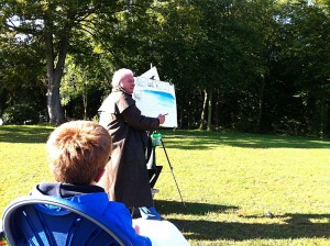
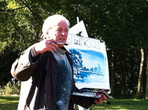
Ashley Jackson demonstration photograph

Ashley Jackson Demonstration

Next, we’re introduced to the principles of capturing umbrella (horse chestnut), lampshade (elm and sycamore) and teardrop (poplar) shaped trees, indeed we are surrounded by the green, red and gold autumnal trees of each of those various shapes! Ashley starts to outline our scene on rag paper –  (140lb Rough) using a pencil stub, whilst extolling the virtues of good composition (check out Turner’s painting of Bolton Abbey for good L-shaped composition).

The composition starts to take shape with the addition of colour washes, using a limited palette of only three colours – Prussian Blue, Lemon Yellow and Burnt Sienna, in varying proportions. We are reminded of the benefits of a real sable brush and of the principles of colour perspective as the scene to our right unfolds before our eyes on the easel. More words of wisdom:

“If it looks wrong it’s wrong even if it’s right”

Ashley Jackson demonstration photograph

Ashley Jackson demonstration


Final point – create four dark corners to prevent the picture falling out of the frame. With the addition of a mount card the picture is a triumph and once again Ashley Jackson has made watercolour painting look so much easier than it really is. Within 15 minutes the watercolour sketch is destroyed as part of the clearing up process.

Inside Cusworth Hall the “Opposites Attract” exhibition features some of Ashley’s fabulously atmospheric watercolour paintings of Yorkshire including some of her roughest Peak District terrain. Each demonstrates the tips we have just been given outside with the exception of how to capture the feeling – without a doubt these pictures really do convey the sense that he sees Yorkshire as his mistress…there’s love in them there hills!

So, a good day had by all and souvenirs for our two budding artists who spent the evening producing even more fine art works!

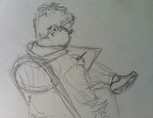
Sketch of Josh sketching

Josh sketching

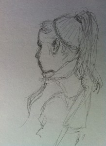
Sketch of Caitlan

Caitlan listens to Ashley

Diary of a large acrylic painting – Part 4

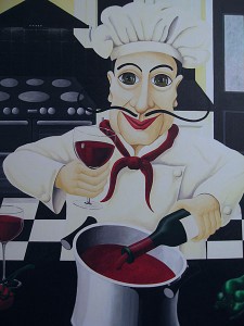
Step 9 – My Excitement is mounting as I reach for my wider colour palette from amongst my box of tricks. The moment I have been waiting for…it’s time to bring Salvatore to life!

How to tempt a good looking Italian chef into the kitchen I wonder, a light Valpolicella or a cheeky Chiantio Classico? Surely a couple of bottles of red will coax him out and for the sake of artistic integrity (research is always important) I just know I will have to test at least one of the bottles from the still life I have set up in my studio to help with my composition. Oh dear, I need to paint a glass of wine…it seems that time is now!

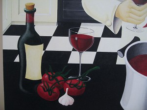
Close up of Wine bottle, glass and tomatoes

Salvatore’s cooking ingredients – good enough to eat!

It’s been a long time since I have sat and truly exercised my powers of observation, but the wine glasses in my large acrylic painting have quietly troubled me since I was asked “so, how do you paint something that’s see through?”

I hadn’t really thought about how I would tackle them until now, but as the saying goes “necessity is the mother of invention”, my response: paint what you see!


Step 10 – A good helping of flake white aded to my stay wet palette I’m ready for…

Close up of Salvatore chef  from the painting

“Salvatore” arrives – Cheers!

…a touch of Cadmium Red (light), followed by a little yellow ochre, (sip)

…gently darkened in places with a little burnt sienna

…a smidgeon of Alizirin Crimson…

…blues eyes or brown?

Decisions, decisions, let’s go hazel…

Well, hello there Salvatore!!

I don’t mind if I do…Cheers!

My very large acrylic painting is nearly finished – add olive oil, green and chilli peppers, large orange cat in top hat (yes, that does say “large orange cat in top hat”), signature and a frame and we’re ready to go. OK, so there’s some time involved, weeks in fact but…

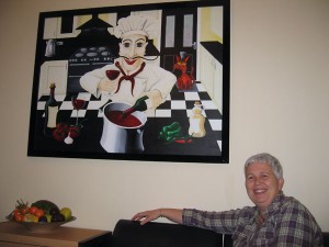
Step 11 – Hang! Welcome to your new home Salvatore!

That used to be that “really big empty wall in our kitchen” – turned out quite nicely, judging by the smile on my face! You can check out this and other large acrylic paintings (and some smaller ones) in my KL Art Gallery

"Salvatore Cooks For..." Photograph of finished painting

“Salvatore Cooks For…” home at last