Burlesque!

Yes, burlesque!

I’m not sure quite where this started, but guess it’s thanks to parents with some fairly eclectic tastes and a piano for entertainment and I’m about to confess – I’ve always liked musical theatre! There you, go, done, it’s out there…..I like musical theatre! Not as a performer of course! I was always a shy kid with uncontrollable curly hair, so not for me the spotlight and greasepaint…I only went to ballet and tap on a Saturday morning because I got pocket money for a bag of crisps and a 7 Up and it provided a chance for a giggle with my sister – I’m sure she took it more seriously than me really, cos she was the pretty, girly one with the hair that could be moulded to satisfy any of the latest fashions. I would have liked to dance and dance well, but it just wasn’t meant to be I was just much better at playing Peter Bonetti in the Chelsea Goal or goalscorer Peter Osgood – In later years my dance teacher at college could only praise me for having nice teeth!

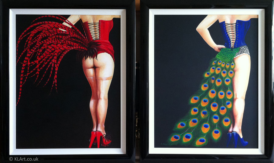
Despite my own shortcomings though I always enjoyed the rythms of tango related dance, the sensual imagery of life after dark, the black and red imagery in the musical Chicago and the sensuous stacatto dance scenes in Cabaret, including of Liza Minelli and that chair and all that jazz, and of course the opulence and feathers of La Cages aux Folles at the London Palladium.

When the chance came up to produce some of my own work, with a short gap between commissions and an invite to the Holmfirth ArtWEEK exhibition, I was desperate to head for a wider colour palette than I had been working in of late and thought ‘what better way to celebrate life and all it’s colour than to turn to some of my favourite things’. Add into the mix my recent viewing of the film Burlesque (yes, the one starring Cher and Christina Aguilera amongst others – cheesy I know, but sometimes a girl just has to let her hair down) and the germ of an idea for my burlesque series was born.

With a range of reference pics from a couple of friends and a clear idea in mind that I wanted to use the black and warm Mediterranean reds reminiscent of those Chicago pictures I opted for the statement sized canvas. If you’re not sure…that’s the one that’s just big enough to be spotted in a sea of paintings at Holmfirth ArtWEEK (hopefully – it would be great to get invited back next year as a professional artist).

The canvas is also:

  • big enough to prevent you seeing the whole picture without stepping away from the easel once in a while
  • greedy enough to take up a full tube of Ultramarine Blue  and Burnt Sienna when mixing a chromatic black background for 2 pictures.
  • Very expensive to frame as it measures over 10 ft round the edges!

It’s also great to work on that scale once in a while though and so much more physical than working up to my more usual A4/A3 size – it means you paint with your whole body and being, rather than from the wrist, great fun!

OK, so in retrospect, I wonder why I set myself the challenge of two such highly detailed paintings – opting for feathers in both was certainly a decision I variously celebrated and regretted in equal measure as I felt alternately that I would and then wouldn’t meet my deadline for the framers.  Fortunately my A team (Pomfret Gallery in Pontefract) came to the rescue with a cunning plan to measure and cut the frames whilst I painted in the finer detail, which bought me 2 more days…a solution I will be forever thankful for! It’s great when a small business personalises their service for you and pulls out the stops to alleviate your stress, not to mention the impact of their job well done – thanks guys!

I have a clear favourite between the two pictures, which I will keep to myself for now. As you might expect of any self-respecting artist I also have some clear ideas about where and how I would improve my art, the bits I am highly satisfied with and thoughts about how my ideas will be modified in future.

That said I am generally pleased with the results and felt a tear welling up when they came home from the framers and a certain surge of pride when they were handed over to the team at the Holmfirth ArtWEEK venue. I have enjoyed my short journey into the world of burlesque and painting in a pop art style and would love to see them sell and swell the charitable coffers of Macmillan Cancer Support, however I wouldn’t be entirely unhappy to have at least one of them come home as the place is quiet without them!
Burlesque 1 and 2 pictures

You can see Burlesque 1 and 2 at Holmfirth ArtWEEK from Sunday 7th to Saturday 13th July. In the eventuality that they don’t sell – they will be available from this website from Monday 15th July.

Diary of a large acrylic painting – Part 4

Step 9 – My Excitement is mounting as I reach for my wider colour palette from amongst my box of tricks. The moment I have been waiting for…it’s time to bring Salvatore to life!

How to tempt a good looking Italian chef into the kitchen I wonder, a light Valpolicella or a cheeky Chiantio Classico? Surely a couple of bottles of red will coax him out and for the sake of artistic integrity (research is always important) I just know I will have to test at least one of the bottles from the still life I have set up in my studio to help with my composition. Oh dear, I need to paint a glass of wine…it seems that time is now!

Close up of Wine bottle, glass and tomatoes

Salvatore’s cooking ingredients – good enough to eat!

It’s been a long time since I have sat and truly exercised my powers of observation, but the wine glasses in my large acrylic painting have quietly troubled me since I was asked “so, how do you paint something that’s see through?”

I hadn’t really thought about how I would tackle them until now, but as the saying goes “necessity is the mother of invention”, my response: paint what you see!


Step 10 – A good helping of flake white aded to my stay wet palette I’m ready for…

Close up of Salvatore chef  from the painting

“Salvatore” arrives – Cheers!

…a touch of Cadmium Red (light), followed by a little yellow ochre, (sip)

…gently darkened in places with a little burnt sienna

…a smidgeon of Alizirin Crimson…

…blues eyes or brown?

Decisions, decisions, let’s go hazel…

Well, hello there Salvatore!!

I don’t mind if I do…Cheers!

My very large acrylic painting is nearly finished – add olive oil, green and chilli peppers, large orange cat in top hat (yes, that does say “large orange cat in top hat”), signature and a frame and we’re ready to go. OK, so there’s some time involved, weeks in fact but…

Step 11 – Hang! Welcome to your new home Salvatore!

That used to be that “really big empty wall in our kitchen” – turned out quite nicely, judging by the smile on my face! You can check out this and other large acrylic paintings (and some smaller ones) in my KL Art Gallery

"Salvatore Cooks For..." Photograph of finished painting

“Salvatore Cooks For…” home at last

Diary of a large acrylic painting – Part 3

Step 7 – large acrylic painting taking shape and texture (and just a little colour?)

Ok, so the floor’s finished and I must now find a way to create the various shades and textures of black that appear in other areas of the kitchen.

“Salvatore, I’d like to introduce you to Glaze Medium and pearlescent paint, as well as the colours I’ll be adding to separate my blue black gloss-painted kitchen door from the fluorspar flecked charcoal grey black of the worktops and the metallic shiny black of the oven…..” (Yes, I have also developed the rather odd habit of talking to my painting throughout the course of my working day).

A bit experimental, but I’m using a pearlescent medium, combined with a very pale grey paint to under-paint the kitchen work tops and create the fluorspar flecks in the granite.

Salvatore painting with painted kitchen walls and worktops

“Salvatore’s” temporarily spotty kitchen worktops

These will disappear later as I overpaint with darker glazes and dance as they catch the light in the finished painting, but in the meantime it does look rather strange and I have to trust the experiment will work at the time of painting!

The kitchen cupboards prove easier to assemble than an Ikea flat pack and it’s quite nice to have laid some colour on the walls too!

Step 8 – My approach has worked even better than expected so far…

"Salvatore" receives his kitchen appliances

Salvatore takes delivery of his kitchen appliances

and I’m getting quite excited as I add more features to the room, including the appliances and a hint of colour behind the the frosted windows in the door.

The reflected light of the cooker hood is achieved with a dry brush technique over a glazed black wall.

Each completed piece of background brings me closer to the fun stuff in the foreground (why do I always feel like this like this when I’m painting?).

Salvatore is starting to adopt a slightly ivory attitude now too and I’ve reached the point where the picture now makes it’s own argument for the addition of at least a small amount of subtle colour so it’s time to call in my pals for another discussion about our colour palette…

Fortunately, my pals agree with me……..woohoo!!!! Now, where did I put those paints?

You can see the finished colours in all their glory in the KL Art Gallery.