The Big Draw – Ashley Jackson and Graham Ibbeson that sounds like fun!
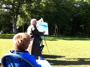
On a cold but sunny Sunday morning we’re up much earlier than usual on our traditional “lie in” day. Warm coats, waterproofs and camping seats loaded we gather up a couple of grandchildren (not mine, but they are known to me, so I haven’t turned into some strange Chitty Chitty Bang Bang Child Catcher) and head for Cusworth Hall, Doncaster. It’s a beautiful day and we’re all set to receive our instructions from Ashley with art pads and pencils at the ready. Whoops! We’re 2 hours early, but never mind!
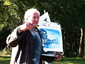
When we get started some time later we’re greeted by Ashley (wearing his trademark long waxed coat over his artist’s smock) and Graham who offer an insight into each others work to get us started. It’s already interesting to pick up their enthusiasm for what they do, their respect for each other and their typically no nonsense “Yorkshireness” (yes, I think I’ve made that word up) – I mean that down to earth bit about them that throws doubt on some of the more modern approaches to “Art”.
We’re off…we’re going to learn how to draw, nay paint, a quick outdoor scene (we only have one hour and at least 10 mins have already passed). First though, a quick tip “for the youngsters” on how to create a boat from the Christian Fish symbol. The closer the boat the fatter it should be and vice versa. Imagination is fired and Josh embarks on a couple of detailed drawings of ships that keep him quiet for the next 20 mins (because Ashley isn’t very inspiring apparently).
Next, we’re introduced to the principles of capturing umbrella (horse chestnut), lampshade (elm and sycamore) and teardrop (poplar) shaped trees, indeed we are surrounded by the green, red and gold autumnal trees of each of those various shapes! Ashley starts to outline our scene on rag paper – (140lb Rough) using a pencil stub, whilst extolling the virtues of good composition (check out Turner’s painting of Bolton Abbey for good L-shaped composition).
The composition starts to take shape with the addition of colour washes, using a limited palette of only three colours – Prussian Blue, Lemon Yellow and Burnt Sienna, in varying proportions. We are reminded of the benefits of a real sable brush and of the principles of colour perspective as the scene to our right unfolds before our eyes on the easel. More words of wisdom:
“If it looks wrong it’s wrong even if it’s right”
Final point – create four dark corners to prevent the picture falling out of the frame. With the addition of a mount card the picture is a triumph and once again Ashley Jackson has made watercolour painting look so much easier than it really is. Within 15 minutes the watercolour sketch is destroyed as part of the clearing up process.
Inside Cusworth Hall the “Opposites Attract” exhibition features some of Ashley’s fabulously atmospheric watercolour paintings of Yorkshire including some of her roughest Peak District terrain. Each demonstrates the tips we have just been given outside with the exception of how to capture the feeling – without a doubt these pictures really do convey the sense that he sees Yorkshire as his mistress…there’s love in them there hills!
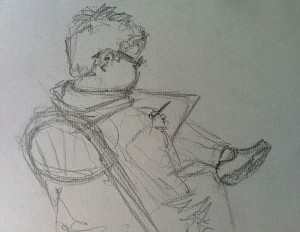
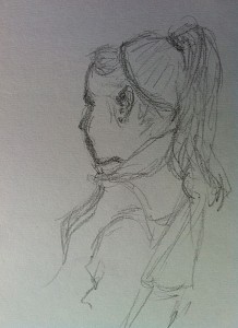
So, a good day had by all and souvenirs for our two budding artists who spent the evening producing even more fine art works!

